Friday, January 29, 2016

DUTCH GARDENS RE-DO

A DUTCH GARDEN 2002


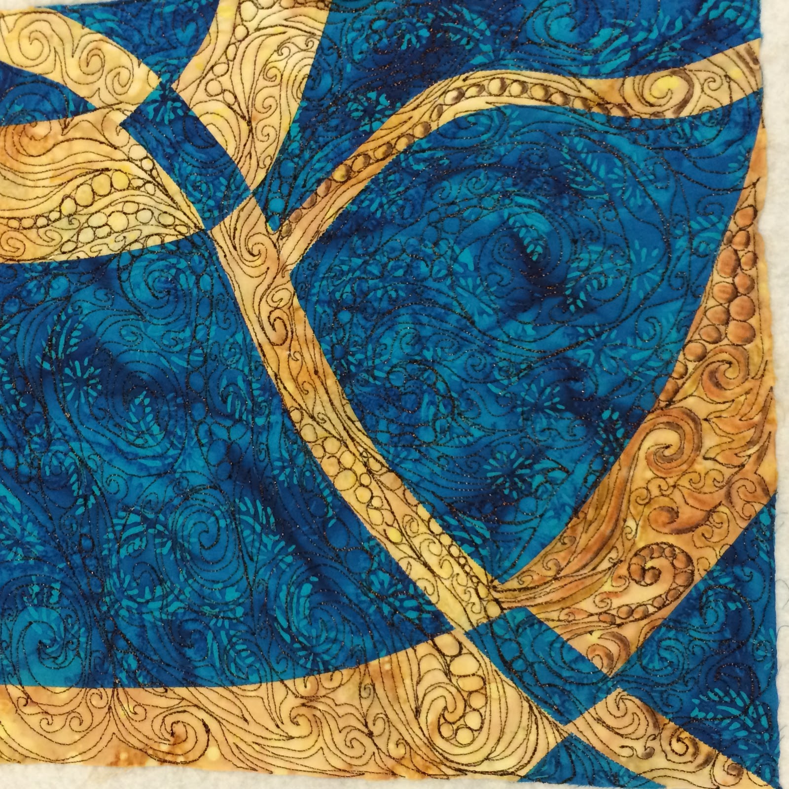
I designed and made this quilt in 2002. It was my first try at interpreting a photo into a quilt and doing something abstract.  The photo had been taken by a friend while she was on a tour of Holland.  Unfortunately, I don't have the photo.  It showed a river of purple Muscari flowing through the middle of the garden with red Tulips and white Anemones on one side and pink Hyacinths on the other.  A large, dark tree was at the back of the garden.

I painted the red tulip pieces onto cotton sateen and then cut them out and appliqued them by machine.


I hand dyed the pink Hyacinth fabric.  It is a silk/hemp blend that was wonderful to manipulate into ruched flowers. I tried doing some three dimensional leaves that ended up looking pretty flat. They also blended too much with the background.


In the end, I liked the quilt but it never hung even close to straight.  I somehow stretched it out in places so that it bulged and hung crooked.  

 
The bottom edge was very wavy.

  
A few weeks ago, I decided to see if I could straighten the edges by easing them into the right size using Pearle Cotton. I stitched along the binding and then gradually pulled up on the stitching until all the edges laid flat.  Well, I mostly got the edges to lay flat and straight but then I noticed there was severe bulging in the body of the quilt.

So, I decided to see what would happen if I added in large embroidery stitches that would add texture and allow me to gradually ease out the bulge.


Grass done with large stitches and #5 Pearle Cotton thread.


 Here I've added in "grass" where the bulging was really bad.  It's really great because I had also realized that I had not put much quilting into this piece, so now I've added in more stitching that is also very full of texture.  You might also notice that the leaves have been manipulated to look more like actual leaves. No more flat leaves.


 I loved the texture so much that I decided to add in stitching around the Tulips and Anemones, even though there was not any bulging in this area. I was very careful to not pull too tight on the stitching.


First Layer of Stitching


Three layers of stitching


 I really liked all the texture the stitching had added to the design, and I was getting a lot of the bulge out. The biggest part remained in the purple area where I had couched down a bunch of fuzzy yarn. 

I used black #5 Pearle Cotton to stitch large herringbone stitches into the area and pulled up as much as possible on the stitching.  Then I started adding in large crystal beads as I did the stitching.  


The bulging all disappeared and the crystal beads are all sparkly and wonderful.  

I then added in painted highlights on the tulips, anemones, hyacinths and leaves.  I used Inktense Watercolor pencils, Stewart Gill and Lumiere fabric paints.  Here are some close-ups of the painting.

I painted in veins and a more of a center. Green crystals are in the center now.


Painted leaves and Hyacinth


Then it occurred to me that leaves, toads and frogs would be lovely additions to the grassy and twiggy backgrounds.


Toads and clusters of pink glass bead flowers.


Glass leaves and red tulip beads in the twiggy background.


Last of all, I added in black agate leaves to the tree in the back of the garden. The tree canopy is distressed cheese cloth that has been dyed black.

Here is the finished "RE-Do".


Notice the purple frog that is jumping off of the quilt?  It really added to the fun of all the other dynamic changes that I made to update this piece. I have it hung in my yoga/office room and just love it.  It does wave when it's hanging but there are no bulges or wonky areas anymore. 

I have discussed a large variety of techniques here and I hope that one or more of them may inspire you to either do "RE-Do" or create a new piece.

Off to the studio to Create some more,

Karen

Sunday, January 24, 2016

FRACTURED WATERCOLOR GARDEN: Embellishing with Inktense Watercolor pencils


This piece builds on the "FRACTURED WHEEL" pieces that I published earlier.  In this case, I created two mirror image pieces, quilted them and then "painted in details" before slicing the pieces apart and.... 


Starting at Step One: 

I created the Mirror Image squares using two batik prints.  I used a Bronze metallic thread, FS20 by Madiera Threads.  Here are two photos of the quilting,  and with some embellishment started.


 Before I get into working with the Intense Pencils, I'm backing up to the quilting process.  The quilting on the blue/beige piece was done through freezer paper.


I freehand drew a design then ironed the freezer paper onto the quilt sandwich.  It was very easy to quilt through the freezer paper and I already had an idea of what the design would look like. 


 However, getting the paper peeled off was a real job!  So, for the second square, I figured if I can draw a design freehand with a pen, then I can do it with the machine, so that's what I did.  


I colored in the quilted areas with the Intense Pencils after I finished the quilting. After each section was colored in, I went over it with Golden Fabric Medium GAC900. That smooths out the color and and makes it brighter. It also allows for the blending of colors. In some areas I added in highlights after the medium had been laid down.  The medium also makes the colors permanent, once everything is dry.  I did find out that I had to be careful not to do too much at one time. Bleeding of the color can occur if the fabric gets too wet with the medium.  I only used the color pencils on the beige fabric.


Once everything was dry, I added in white highlights using white acrylic paint.  I also used a metallic white paint to embellish the narrow blue pieces.. Unfortunately, that doesn't show up here but it does in the final piece.


So, after doing all the quilting and the painting, I split the pieces into strips. That's right, I took two finished pieces and cut them apart into strips! 


Here the strips are alternated with each other and ready to be fused to a backing. Trying to seam the pieces together would have taken away from the design and added too much bulk to a small piece.  It finished out at 16" by 20".  


 You can see the white painted highlights on the narrow blue fabric pieces.

After fusing the pieces to a background, I free motion sewed over the seam joinings and then covered them with a bronze colored yarn that was like a silk cord.  I had already embellished each seam line with the same yarn.  


I also decided to add in some bronze highlights on the blue fabric.  I used Lumiere Bronze Metallic paint by Jaquard.


This was a fun way to practice a couple of new techniques and experiment with painting on a quilted piece using both acrylic paints and the Inktense Watercolor pencils.  This method also works well with Prismacolor pencils.  I happen to like the more intense colors that I get with the watercolor pencils. 


I also like working  with printed fabric rather all white fabric. The addition of the fabric print really increases the depth of the design.


 I also love the movement that was  achieved by cutting the squares into strips and then alternating them into a design that weaves in and out with itself.


I love this very elegant piece of art work.  

CREATING ALWAYS IN JOY,

Karen